Thursday, April 30, 2020
Dance Lighting
This photo is striking because of the contrast between the warm and cool toned lights. I like that the yellow, warmer light is cast on their faces to highlight them and their facial expressions, while the blue, cooler light is cast below, blending their bodies in with the stage. The primary focus becomes the dancers and their expressions. The highlights versus shadows in this photo are striking and have a sharp contrast, but the soft toned lights make it appear smoother. The lighting makes good use of color, shadows and direction to highlight a beautiful performance.
Source
Dance Lighting
I found this lighting interesting because it's much more of a sharp, clear white than is usually seen in dance performances. None of the dancers are dressed in bright-colored clothing, and the pale colors reflect a serious tone. It is interesting to see how the light strikes all of the dancers because they are at different heights. The light does not highlight any of their faces, but instead draws focus to movement and their bodies and shapes created on stage. This suggests a highly dramatized and stylized performance. The simple lighting keeps the performance simple but powerful.
Source
Moody Lighting - West Side Story
This is from a production of West Side Story. The dark background is filled with shadows and blue light, creating a suspenseful tension and air of darkness surrounding the scene. The white light highlights the cast on stage and is cast on Maria and Tony being pulled apart by their friends. There is a tense mood on stage, as there is physically a divide being created on stage as the two groups are moving apart. The lighting choices in this scene work to communicate the drama, tension and suspense that is created by the action on stage.
Source
Moody Lighting - Sweeney Todd
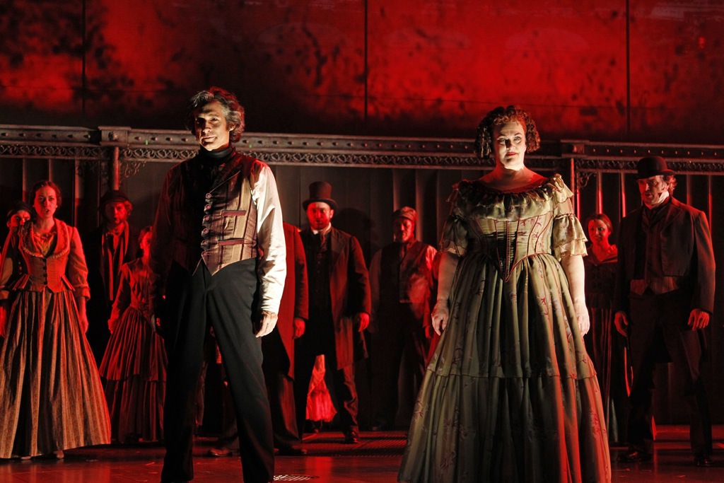
This photo is from a production of Sweeney Todd. Red is an intense color used to light the stage in this scene, only accompanied by dark shadows and minimal white lights. Bold and intense colors create tension on stage and the dark red light on the ensemble moves the front two actors to the center of the audience's attention. The lighting creates an eerie and sinister mood. The intense colors combined with sharp angles of shadows and lighting creates drama, suspense and tension on stage.
Source
Gobos/Texture - Pippin
This photo is from a production of Pippin. There is an interesting pattern created on stage with the projections. They show sharp, straight lines forming an intricate pattern that contrast with the projected images of tree branches. The stage is covered in bright yellow straight lines, forming a complex and repeating pattern, while the projection has dark curving lines. The repeated patterns all across stage highlight the center of the stage, where the actors are the only part that stands out as different. This combined with the bright light on them allows them to stand out from the stage. It appears as if there is a less evident pattern in the bright blue-white lights covering the actors, continuing the theme of patterns and projections. It creates a beautiful scene that is interesting to look at.
Source
Gobos/Texture - West Side Story
This photo is from a production of West Side Story. I like that there is a grid pattern formed on stage. The actors are mostly standing in line with the direction of the grid and the pattern itself creates tension on stage - there are harsh lines created by the pattern and the actors are half hidden by shadows. The pattern draws your eye across the whole stage and through the scene. The colors work well together in the scene to create tension along with the pattern.
Source
Friday, April 17, 2020
Dance Light
I liked this photo because I thought that the lighting on stage (or wherever they are performing) was executed very well to add to the performance while not making it over or underdramatic. For a group of dancers, I think that a big spotlight might be too much, but just simple mood lighting or cyc lights might not be enough. This scenario portrays lighting that focuses the dancers and keeps their facial expressions and movements as the focus.
Dance Row
I really liked this photo of these dancers because of the positioning of the light. The combination of the light coming from the side and the position that all of the dancers are in, it shields the front of their body from exposure, and sort of creates a half-light, half-dark scene. I think the different colors of light also helps create new skin tones for the dancers to possibly try to add to their appearance.
Individual Dancer

I chose this photo of this individual dancer because of how fun and creative they look. They give me Michael Jackson vibes because of the hat and gloves. The lights are positioned very strategically to highlight exactly where to draw the audience's eye. I could see this person dancing to EDM music.
Dance Group

I chose this photo of a dance group because it is so dramatic and powerful. The direction of the light from the left highlights the faces but the background is dark and smokey. The pink and red evokes a powerful mood. I imagine they are dancing to a heavy hip hop song with deep bass.
Thursday, April 16, 2020
"Dance" lighitng
I think this picture is well done, the man posing is back lit by the sun that is just peaking out from begin his head. The fact that we the audience cant really make out any details of the man forces us to take in the details we can see.
found at: https://www.liveabout.com/chinese-martial-arts-styles-2308295
Dance Lighting
I really like the "Troness" of this picture. The people in the picture are the only source of light in the scene so they become defined in their own light and are lost in the darkness without it. the fact that they all share the cool colors and if you watch the video can turn the light off makes this great.
found at: https://www.youtube.com/watch?v=vpcsu9rcwG4
found at: https://www.youtube.com/watch?v=vpcsu9rcwG4
Dance

This is a good example of the lighting designer and costume designer working together. The pink light goes well with the pink of their outfits and can kind of trick the eye into seeing more of a gown than a jumpsuit.
Source:https://www.josephleephotography.com/dance
Dance Lighting 2
This image shows an example of a high intensity light allowing the audience to see most of the dancers’ forms. But it’s interesting that the light changes on different levels of the space: some of the dancers kneeling downwards do not have as much light on them as the ones who stand upright. The bright yellow works well to show most of their movements and has an effect to highlight them even though they are wearing black costumes.
Dance Lighting 1
The light in this scene is generally quite dim, but certain areas are lit up more than others. The main blue color in the background and costumes is quite relaxing and mysterious. The dancers’ faces are highlighted, alongside their arms and the female dancer’s legs. I think the choice to light up only these areas is very dynamic and highlights the dancers’ different movements.
Silhouette
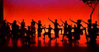
The use of the Cyc light to illuminate the background to the extent of making the dancers into silhouettes would help to accentuate the movement of the dancers. The color of the light seems to hint a sunset on the savanna hand the tree's silhouette resembles an African tree so this might be from a rendition of the Lion King.
Source: https://arts.ufl.edu/academics/theatre-and-dance/programs/lighting-design/
Wednesday, April 15, 2020
Dance Lighting
The dancers in this image are from the shadows of the cast in the back. The lines help divide the different dancers and their respective moves. Also some of the shadows are slightly different, which also helps distinguish them from each other. Things like the height difference are noticeable too.
Dance Lighting
My favorite thing about this picture is how the dancers are divided up on the stage through the use of the lights. This way, if one of the dancers is going to do something different from the rest, it is easy to pinpoint and notice. Another cool example of focusing attention somewhere is by changing the color of the squares, as seen in the far back left corner. I feel like this format of lighting is going for showing off individual dances or just keeping a group dance look focused and clean.
Dance Lighting
I love the lighting in this dance performed by the Rockettes. I really like the low light that sweeps the stage in a purple hue. I like that this light highlights the dancer's sole supporting leg and shows the uniformity of the line of dancers. I also like that the lights make the dancers highly visible. I also think that the light brings out the green and red of the costumes. I like the lights in the other elements of the set, and I think that it helps create the atmosphere of New York and Radio City Music Hall. I think the lighting for this dance helps create excitement.

Dance Lighting
I really love the lighting for this dance scene from Cinderella because it models the characters beautifully and highlights the form of the dancers. I think that the soft white light brings out the colors of the costumes. I really like how the light makes the actors selectively visible with the background only dimly lit. I also like how the dancers are fully visible, as the audience is even able to see the feet of the characters. I think that the lighting portrays a romantic mood that elevates the dance.

From: https://www.pnb.org/repertory/cinderella/
From: https://www.pnb.org/repertory/cinderella/
Tuesday, April 14, 2020
Dance Lighting - Shape and Lines

This lighting is a good example of how shapes can be used to enhance the lines created in this dance. The use of four elongated rectangular shapes over each of the dancers allows the viewer to see the dancers as individuals as well as see the group as a whole, working together to create one picture. Along with this, the direct overhead light casts a very dramatic shadow over the dancers, and when combined with the sharp lines, gives the viewer a very intense picture to take in.
Dance Lighting - Color
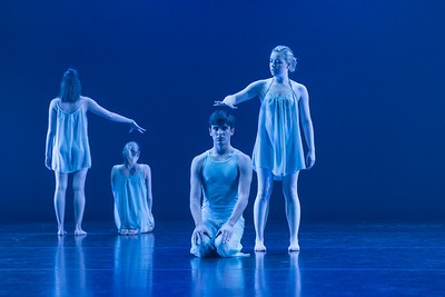
I think this photo is an interesting example of the use of color in dance lighting. To begin the stark white color enhances the bleak feelings already seen by the small shapes of the dancers and their facial expressions. Along with this the lack of direct lighting does not give the viewer a place to focus and allows their eyes to look everywhere. Overall I think this lighting does well to capture the feelings of this dance.
Friday, April 10, 2020
Moody lighting
I imagine that the colors used in this scene are intended to display something going on in the nighttime, something that's causing stress to the people on stage. The purple in the background and the shadows in front of it with the respective poses seem to be distraught, while the people on the prop look as if they're under a streetlamp. This is mostly due to the color and
Moody lighting
This image is from Blade Runner 2049, which shows the protagonist walking into a vast nothing of orange. The shot is intended to make the audience feel like Ryan Gosling is walking into the unknown, completely unsure of whats to happen. The orange leads me to imagine that wherever he is going might not be suitable for his survival, as literally everything is orange and suggests radiation or chemicals in the air. Also with the context of the story, whats at stake for him sets up the mood of the shot.
Thursday, April 9, 2020
Moody lightning
This scene sets off my bad news alarms in my head. The fact that the only light comes from up stage and messily spills in to the scene leave so much shadow means that anything can be in those shadows. I imagine that some dramatic even could occur in the lighted portion and then out of the shadows co9mes, something...
found at https://www.pinterest.com/pin/495818240209522103/
Moody Lightning
This scene really makes me feel sad, yet hopeful for the future. The overtones of blue on the majority of the set give me the sad feeling, and the bright moon in the back gives a nice counter point to the blue.
found at https://www.pinterest.com/pin/512284526355058856/
The Crucible

This scene comes from a rendition of The Crucible. In the play, a man is put on trial over just accusations. The lighting's focus gives a sense of isolation as it fades around the two actors to reinforce the idea of the rest of the town is against them. Then blue, of course, shows their sadness at the very possible bad outcome of the trial.
Source: https://www.pinterest.com/pin/835840012078451665/
Carefree Lighting
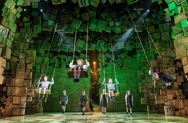
The stage here is very well lit which gives the scene a carefree feeling, and this mood is supported by the action on the stage of the children swinging which is just a simple wholesome act.
Source:https://www.nultylighting.co.uk/blog/lighting-theatre-musical-stage-production/
Moody Lighting - Addams Family
This image comes from a production of “The Addams Family” musical. The lighting design here coincides with the set design and costuming to create the chilling mood of a graveyard in the first song. Low-intensity, blue light and even some spots of darkness surround the protagonists to show their environment during the nighttime. While the family is focused in a brighter light, I think some of the darker spots of the stage work well alongside the grey costumes and set, and the cyclorama which depicts a spooky purple/orange sky.
Moody Lighting - Vertigo
This still is from the film “Vertigo” by Alfred Hitchcock. I feel that the lighting in this scene communicates a heightened and overwhelming mood. The chilling green light comes from a neon sign outside the female protagonist’s window. But at this moment, which is very exaggerated, the low green light adds to this unrealistic atmosphere.
Dance Lighting - Florence + the Machine "Big God"
This still, from Florence + the Machine's music video for Big God, is set in a pool of shallow water. The lighting itself is rather subtle, but the flooring gives it an extra dimension in the vivid reflections that appear. Additionally, the reflections have the unique property of splashing and rippling with the dancer's movement.
Source: https://youtu.be/_kIrRooQwuk
Wednesday, April 8, 2020
Dance Lighting - Kendrick Lamar at the 2018 Grammys
Kendrick Lamar's 2018 Grammy Awards performance, with U2 and Dave Chappelle, uses only three colors of light: the red, white, and blue of the American flag. The majority of light comes from side lights, adding visual tension to the political tension of the song and performance, and highlighting the movements of the identically-costumed dancers, who (along with Kendrick Lamar) take up the entire stage.
Moody Lighting
I really like this lighting in this scene from Aladdin because it conveys a romantic mood. I think that the low-intensity light that makes the couple visible helps them stand out from the background. I think that the background of the city with the lights in each window help to create the mood and establish the setting. I really like the house lights because it shows that the couple is out together at night. I think that the hue or color of the sky also shows the couple together as the sun is setting, as the light is dim and creates a purple color that drapes the surrounding city. Overall, the lighting in this scene creates a peaceful and romantic mood.
Moody Lighting
I think that the lighting is interesting in this scene from a production of Macbeth because it uses light and shadow in a very unique way to create a scary and intense mood. I think it is interesting that most of the light sources in this scene are non-standard fixtures, including lanterns and fixtures that mimic candles. I like this choice because it dates the scene back in history, making it more real to the period of the play. In this way, the lighting fixtures create part of the physical environment, contributing to the establishment of the setting. By revealing a hidden struggle and a seemingly hopeless reaction to that struggle, the mood created by the lighting seems very scary and ominous, as concealed struggles are happening and cannot be prevented.

From: https://dctheatrescene.com/2018/09/12/review-folgers-alt-macbeth-a-strange-perfection/
Moody Lighting 2 - Modern House
This image has a few layers of lighting with distinct moods. The house itself is well-lit with yellowish tones, creating a comfortable but lively environment. Outside, the lights remain warm, but become much more sparse. They are bright enough only to see by, creating a more deliberate mood and embracing the night, fading into it completely past the plants around the outskirts of the house.
Source: https://www.plataformaarquitectura.cl/cl/02-227851/tuunich-kanab-seijo-peon-arquitectos/50f9831fb3fc4b590a00011b-tuunich-kanab-seijo-peon-arquitectos-image
Moody Lighting 1 - Parasite
This still, from Bong Joon-ho's Parasite, shows the Kim family in their partially-underground apartment assembling pizza boxes to make money. The florescent lighting, though dimmer than it probably was upon installation, is still oppressively bright, highlighting the dirt and mold around the apartment. Combined with the cramped physical space, this lighting shows the apartment as a firmly uncomfortable place.
Source: https://www.npr.org/2019/11/05/776388423/the-hit-movie-parasite-puts-basement-structures-in-structural-inequality
Gobos/Texture 2 - Der Menschenfeind von Molière
This photo, from a Deutches Theater production of Der Menschenfeind von Molière, shows a gobo used as an extension of the set. Throughout the show, actors move through and around the hanging rods that can be seen here. However, in this particular scene, light is split into similar vertical lines, so actors in front of the rods can appear partially obscured by them.
Source: https://www.deutschestheater.de/mediathek/fotos/menschenfeind/
Source: https://www.deutschestheater.de/mediathek/fotos/menschenfeind/
Gobos/Texture 1 - Three Sisters
This image is of a scene from the Münchner Kammerspiele's production of Three Sisters—the play was extremely experimental and visually abstract, and this particular lighting cue played a large role in that. It was left up before the show began, and reappeared between rapidly-switching scenes to ground the audience in a familiar, comfortable, and relatively natural setting of glowing, warm-hued clouds.
Source: https://muenchner-kammerspiele.de/inszenierung/kennedy-drei-schwestern
Source: https://muenchner-kammerspiele.de/inszenierung/kennedy-drei-schwestern
Monday, April 6, 2020
Dance 2

I chose this this image because I thought that it warranted merit how in dance, light often comes from bellow the performers. This example of light up floor tiles is just one instance of interesting lighting from below dancers. Often these kinds of lights are electronically controlled and can be programmed to change colors to the beat of the song.
Source: https://www.nytimes.com/2019/11/06/style/jjs-hideaway-williamsburg-bar-brooklyn.html
Dance 1
This video uses light in a very interesting way on the background dangers. There is a veil screen in between them and the singers. This screen is used to hide and then show the dancers throughout the song through different uses of lights. I think that this is a very fun and interesting way of using lights.
Link: https://www.youtube.com/watch?v=mxdEJwWaue8
Mood 2

The lighting in this scene creates a sad somber mood surrounding the central actor. The Blue behind the screen does well to set a sad overtone from the back. The way that the overhead light is positioned and angled on the center actor to hit them slightly from behind so as to plunge their face into darkness only works to enhance the sadness of this scene.
Mood 1

The lighting in this creates a romantic mood. The warm colors help to enhance the intimacy the main couple are having in the foreground by lighting up their skin, like the heat between their bodies.
Source: https://www.bl.uk/20th-century-literature/articles/a-punchdrunk-approach-to-making-theatre
Selective Focus 2 - Dreamgirls
This scene from the Savoy Theatre in London's performance of Dreamgirls showcases almost every technique possible to set the group apart from their backup performers. Their physical position, triumphant in their in-play show as well as on the actual stage, their brilliant red costumes, and the clear natural lighting on the three singers contrast the solid blue light covering everything else on stage excellently. One's eyes are drawn directly to the three singers and then upwards.
Source: https://www.thestage.co.uk/reviews/2016/dreamgirls-review-at-savoy-theatre-london-a-dream-of-a-show/
Source: https://www.thestage.co.uk/reviews/2016/dreamgirls-review-at-savoy-theatre-london-a-dream-of-a-show/
Selective Focus 1 - Stormzy at Glastonbury
This is a scene from the UK rapper Stormzy's performance at Glastonbury 2019. As expected, he is the primary focus of the show, which is accomplished by lighting the front of the stage relatively clearly, whereas the set and dancers are obscured in clouded and broken-up blue light. However, they are still lit enough to be clearly visible, and are the second focal point of the show. Their relatively diminished, but present, lighting and positioning above the ground gives the effect of reducing Stormzy's size, so that his presence is clearest but not distracting from the show's other visual elements.
Source: https://www.nme.com/festivals/glastonbury/inside-stormzys-epic-glastonbury-stage-show-2519372
Dance Lighting
The lighting in this dance is very powerful. The light is not overbearing and simply just highlighting the dancers and their art. It also helps define the movements of the dancers by adding more dramatic shadows to their bodies causing for more notice of their art. I also think that is very elegantly lighting the costumes by staying in a very similar color palette and not straying far away from the idea of the piece. I also like how the top cyc-lights are black, forcing the attention of the eye to the dancers even more.
Dance Lighting
The lighting in this performance is very successful in my opinion. By using a warmer toned lights on the dancer and then cooler toned lights on the musicians in the back, you are focusing the attention on the dancer but not placing the others in the dark. This idea flows by having the purple flood light only being in the area where the dancer is moving. I also find that the lighting works very well with both parties outfits and bring out the details of each costume design elegantly.
Selective Focus
In this image, two actresses are hidden by dark blue lighting while the other actresses are cast in white light. Our eyes are naturally drawn to light, so by casting white light on stage it automatically signals the audience members to pay attention. The dark blue light helps the other actresses blend into the background and signals viewers that they are not the focus of the scene.
Source
Selective Focus - West Side Story
This photo is from a Broadway production of West Side Story. The lights are dim around the ensemble cast in this scene, drawing attention to the couple in the spotlight. The audience can see the ensemble clearly enough to notice their attention is focused on the couple in the middle, further directing their attention to the center. The use of spotlight works well to create drama and focus on the main dancers in this scene. It is a bright, white light that is sharp and focused, clearly directing the audience's attention.
Source
Thursday, April 2, 2020
Single Beam Mood Lighting

This lighting is a good example of the dramatic way direction can have an impact on size and shape. These things can also impact on what an audience feels about the character and the moment in the show. By having one beam of light come from above the character appears smaller and also creates an incredible shadow, drawing in the audiences attention. This impacts the mood in a variety of ways and peaks the audiences interest.
Happy Lighting

This photo is a really interesting example of how color can impact mood. By using pinks, oranges and softer tones to display a sunset the lighting here is communicating to the audience a general joyful and happy tone. The various colors and layers to the lighting make sure that there is not one feeling commanding the stage and the audience is able to view a variety of colors, and feelings. Overall this lighting design helps the audience to feel a sense of joy that is neither overwhelming or draws away from the focus of the show.
Mystical Lighting

This photo is a great example of the way the texture of lighting can impact shape and the look of a space. The color allows for a mystical tone and gobos/texture lead to an interesting creation of shape for both the actress and the set. By adding shadows into the scene but also highlighting the actress the focus is obvious and yet the audiences attention is captured. The presence of shadows forces the audience to look closer and gives the set a mystical feel.
Chandelier
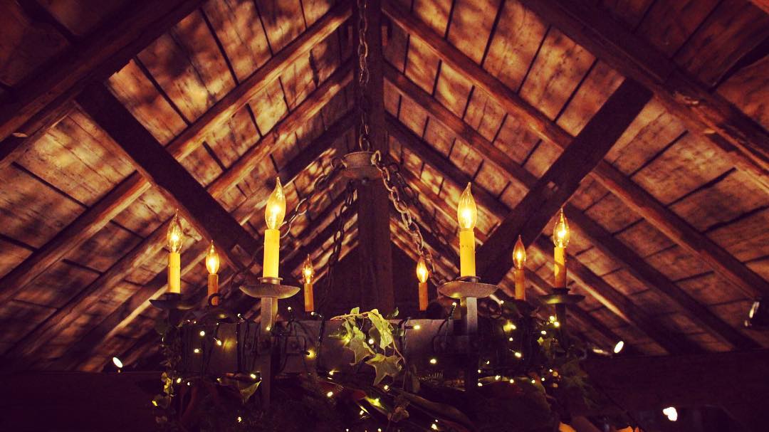
I love this photo of really textured lighting because of how dramatic it is. First, the use of nontraditional lights allows for their to be a softer, yellower color and gives the viewer a sense of what the lighting is trying to communicate. Then the texture adds another layer to this by giving the light a naturally filtered look. This type of lighting lets the audience know that something important is occurring. By not giving any specific focus, the audience is drawn closer and forced to pay attention. Overall, this is lighting does well to create a tone and capture the audiences attention.
Subscribe to:
Comments (Atom)


