Saturday, February 29, 2020
Thursday, February 27, 2020
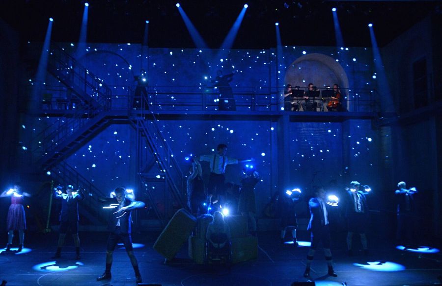
Movement in Lighting - Wicked
I chose this clip from a Tony performance of "Defying Gravity" because it is a good example of lights being used during a live performance to create and enhance movement. The actors are under direct lighting for the majority of the performance, which results in their movements creating sharp shadows that emphasize their movements. At the end of the performance, when Elphaba is up in the air flying, the lights help create the illusion of her flying. There is a spotlight focused on Elphaba to make her stand out from the stage which is hidden in shadows. Color, particularly dark blue, is used in contrast with darkness and this is effective in creating movement, especially when creating the illusion of flying. As she is rising in the air, the lights rise with her to reflect her movement.
Wednesday, February 26, 2020
Movement in Lighting - Green Light
I chose the video for "Green Light" by Lorde because most of the video relies on fast-changing lighting. There are some scenes where she is in a nightclub and there are different colors of lights flashing around her. The backlighting puts her in shadows and between each flash you can see her shadow moving. As she moves throughout different scenes in the video, different colors of lights are flashing on her. In several scenes, she dances around and moves through bright white lights and shadows, highlighting her movements. In one scene, the green light shines down on water, and you can see the green light reflected on her face moving as the water moves. Color is used in contrast with darkness and it is particularly effective in this example for highlighting movement.
Moving Light - Distortion
https://www.youtube.com/watch?v=LGD9i718kBU
This is a music video for the Psychedelic Furs song "Love My Way". Several scenes in this music video feature moving lights of various colors focused on the band members. There are lots of effects to distort their faces used in the video, but the light really contributes to this as well. The light pattern dances across their faces in a very strange and inconsistent way, making them seem distorted and giving texture to the images.
This is a music video for the Psychedelic Furs song "Love My Way". Several scenes in this music video feature moving lights of various colors focused on the band members. There are lots of effects to distort their faces used in the video, but the light really contributes to this as well. The light pattern dances across their faces in a very strange and inconsistent way, making them seem distorted and giving texture to the images.
Moving Light - Spotlight
https://www.youtube.com/watch?v=BIiZuAVZH4w
This is a clip from the "Damn Yankees" film in which Bob Fosse and Gwen Verdon perform "Who's Got the Pain". This dance scene features a simple moving light, just a spotlight, but it enhances the dancers' movements. It moves alongside them seamlessly, mostly horizontally, making their dance keep forward momentum and focusing the viewer's attention on each of their moves.
This is a clip from the "Damn Yankees" film in which Bob Fosse and Gwen Verdon perform "Who's Got the Pain". This dance scene features a simple moving light, just a spotlight, but it enhances the dancers' movements. It moves alongside them seamlessly, mostly horizontally, making their dance keep forward momentum and focusing the viewer's attention on each of their moves.
3-D Printed Optical Illusion
Lighting Optical Illusion
I found this video very interesting because rather than making optical illusions with different types and shapes of light, this illusion is just a simple light source that takes advantage of the movement of an object. Movement from the thing that is being illuminated can also help create a dynamic scene, even if you only have 1 light source. Depending on what the light shines on, a shape is given off, and that shape helps create movement in this optical illusion, but I feel that this can easily can also transcribe over to bigger stages as well.
I found this video very interesting because rather than making optical illusions with different types and shapes of light, this illusion is just a simple light source that takes advantage of the movement of an object. Movement from the thing that is being illuminated can also help create a dynamic scene, even if you only have 1 light source. Depending on what the light shines on, a shape is given off, and that shape helps create movement in this optical illusion, but I feel that this can easily can also transcribe over to bigger stages as well.
Blinding Lights Music Video
Blinding Lights Music Video
The music video for "Blinding Lights" by The Weeknd is a great example of movement in lighting. The setting of the video is Las Vegas, also known as Sin City, which is famous for its casinos with their plethoras of lights. In the video, there are many cases where the buildings have lights that are flashing or strobing in a way to make them seem like they are moving. Additionally, there is the blur effect of light in plenty of scenes, not from the light moving, but instead from the camera/point of view moving to create a distorted effect.
Movement
Movement
Moving Light 2
The use of stage lighting in this video really enhances the feeling of the performers being a robot like group. The flashing lights also helped to hide their individual identities within the collective. Both of these things that they were trying to create.
Moving Light
The use of lights on these dancers is quite creative. They use lights to create moving images that would be difficult to do otherwise on stage. It is quite interesting to see when people are brought in and out of the scene en mass.
Movement in Lighting
https://www.youtube.com/watch?v=_MVulhe-uZ4
This beginning of this video shows a spread of lighting that shapes the black space into an "X" repeatedly. As well, there are points in the video where the lights are formatted to create a plane, which reminded me of the ones from 2001: A Space Oddessey. Another very quick illusion of movement is seen at 1:24-1:27, where it looks like the lights are circling. The nature of the show is very quick and chaotic, and this circular moment builds suspense towards the next part, where it blacks out.
This beginning of this video shows a spread of lighting that shapes the black space into an "X" repeatedly. As well, there are points in the video where the lights are formatted to create a plane, which reminded me of the ones from 2001: A Space Oddessey. Another very quick illusion of movement is seen at 1:24-1:27, where it looks like the lights are circling. The nature of the show is very quick and chaotic, and this circular moment builds suspense towards the next part, where it blacks out.
Movement in Lighting
https://www.youtube.com/watch?v=wPw4H5UJV90
0:27 One of the interesting lighting displays in this video is whenever the lens pulsates, but the throw is steady. I feel like the bulb itself is taking the attention here, since the light itself does not change, but the bulb does. It also changes colors while the light stays the same blue.
0:27 One of the interesting lighting displays in this video is whenever the lens pulsates, but the throw is steady. I feel like the bulb itself is taking the attention here, since the light itself does not change, but the bulb does. It also changes colors while the light stays the same blue.
Interesting light/Tech
This is just awesome technology, it uses light to create a 3 dimensional art work to with. This shows how light can be used in ingenious ways to create things that were once only considered to be Science fiction.
https://youtu.be/V7V05T4DhrU
No Tears Left to Cry video
https://www.youtube.com/watch?v=ffxKSjUwKdU
I chose Ariana Grande's No Tears Left to Cry music video. There are so many interesting, artistic choices made by the videographer concerned with angles and movement. There are so many opportunities where lighting enhances it. Ari's shape and form is altered and enhanced by lighting.
I chose Ariana Grande's No Tears Left to Cry music video. There are so many interesting, artistic choices made by the videographer concerned with angles and movement. There are so many opportunities where lighting enhances it. Ari's shape and form is altered and enhanced by lighting.
Lights Up video
https://www.youtube.com/watch?v=9NZvM1918_E
I chose Harry Styles' music video for Lights Up. He uses a wide variety of colors and directions in his lighting. Because there is such a variety of lighting styles, it can alter the shape and form of figures in the video. Movements become almost disorienting.
I chose Harry Styles' music video for Lights Up. He uses a wide variety of colors and directions in his lighting. Because there is such a variety of lighting styles, it can alter the shape and form of figures in the video. Movements become almost disorienting.
Tuesday, February 25, 2020
Dance Lighting
Spinning Ball Illusion
Movement in Lighting
I really like the lighting that this LED cube provides. I like that the creator of the cube made it out of one color, which is more uniform to be able to show movement. When an individual light turns off, new lights turn on so that it appears the light has moved. This illusion is really cool because the speed of movement can be adjusted, and the lights can be turned on in a way that creates different patterns, such as cube shapes or even numbers. I really like the cues that created movement that looked like rain. Because the cube is the three dimensional, this effect is enhanced, which makes the perceived movement more realistic.
Movement in Light
In this video the movement of light is produce through rod LEDs. The lighting designer was able to create many types of movements with the lights but the must successful ones were when the lighting designer attempted to recreate the movement of rain or a bouncing ball. Another success within the lighting design was the forming a swirling movement along with a movement that expanded and retracted.
Movement in Light
I like the way that movement is shown in this lighting piece as it looks as though the lines are climbing up building to eventually burst and become a spherical piece. Also using stark bright lights on all the boxes different surfaces created a pulse effect. Later on, the boxes transform into a city with lights still moving at fast paces and it looks as though cars are moving through the boxes. I believe this video captures many different ways that light can be used to produce movement in a static set piece.
Movement in Lighting
I really like the lighting in this video because while the LED strips are still and static fixtures, the different individual lights flashing create a chase effect, making it appear like one light is rapidly moving. I really like how at the beginning of the video, the light cascades down the fixture like a waterfall. I also really like how later in the video, the light fixtures are able to create different patterns that appear to be the same lights moving. This fixture is a static piece of art that creates the illusion of movement. I really love this piece, and I think it would be really cool and versatile to have as a source of light. I also think that the color changes create a vibrant atmosphere that matches the excitement created by the quick perceived movements.
Thursday, February 20, 2020
Interesting Lighting Design - Light Beams

This photo is very interesting because it shows how the color of a single beam of light can impact the viewers expectations and emotional association. There is a dramatic contrast between the amber light beam and the white light, something in other (non-theatrical) contexts that wouldn't be as apparent. However, in this context on stage and combined with the fact that it is a single beam of light, you can see how the white light is much more dramatic and creates a different feeling than the amber light, which has a softer and less dramatic tone. The combination of both is an interesting choice and not one I am sure I would agree with because it seems to split the attention of the viewer and not communicate a very clear message.
Confusing Lighting Choices - Roses

While this picture itself is interesting to look at, the color choices are confusing to me. The yellow and blue don't seem to be colors that either go together well or match the red of the roses. The shadow it creates as well don't contribute to the shape of the rose and makes it difficult to look at. Overall I am not sure if I enjoy this photo because it does not invoke a specific reaction or emotion, however it is unlike other photos I have seen.
Unproductive Colors

This lighting I think is bad because the colors are not used into a productive manner. They don't highlight any specific aspect of the stage and they're not complimentary; it's just not well done. There is no homogeneous flow to the lighting that makes it easy on the viewer to follow the action on stage.
Too Many Useless Lights

This lighting is bad because it doesn't add anything to the appearance of the stage or any story. The light is unproductive and chaotic. There are so many places highlighted that it overwhelms the viewer. Just looking at this picture makes me crazy.
Lots of Blues

Too Intense Light

Concert Lighting

These purple lights were suspended and would move up and down which was really cool. I like that even if the purple lighting was so strong that the blue back lighting managed to light the space.
Chicago Lighting

This is a picture from a production of Chicago I did over the summer. I love how the red lighting on the dancers and how it makes the black costumes pop. I also like how the red related to the red set. The yellow cyc lighting also adds really good contrast.
Bad Lighting

This is from a play entitled "The Wind in the Willows." I dislike the lighting colors because I do not think the blue color enhances anything in the play. Additionally, it creates awkward circles on the ground that are not flattering. The sides of the stage are also way too dark, and it is difficult to see the actors.
Wednesday, February 19, 2020
Interesting Lighting - Der Kaukasische Kreidekreis

Source: https://www.berliner-ensemble.de/en/production/the-caucasian-chalk-circle
Bad Lighitng

I really do not like the stage lighting in this picture. It is way too dim for such a large concert. I wish more high intensity colors were used because the audience seems to be completely in the dark.
Interesting Lighting: Heathers

This photo is from a performance of "Heathers". I like that the characters are well-lit and clearly able to be seen, and that the light shining on them is similar to the colors they are wearing. It makes the characters stand out more, as they are being lit directly from above with colors that they are wearing. However, I think this is a weird choice because it feels very distracting to me. I think it does reflect the chaos and absurdity of the show, but I wish it had been done in a way that was less distracting. I would hesitate to call it bad lighting even though I don't love it, because I think the colors are visually striking and reflect the mood of the musical.
Source
Interesting Lighting - Der Hauptmann von Koepernick

Source: https://www.deutschestheater.de/programm/a-z/hauptmann_von_koepenick/
Interesting Lighting: Spring Awakening
This photo is from a Broadway production of "Spring Awakening". I think the lighting is really interesting because the lights are focused on the actors and their bodies. The lights cast down on the actors are striking, but soft enough that it isn't overwhelming to look at. The blue overtone gives it a mysterious and mystical feeling, and the lights against the dark background give the appearance of a night sky. I thought it was interesting that some of the actors are lit brightly enough for the audience to see their faces while others are hidden in shadows. I think that overall this is visually appealing and the colors were well done.
Source
Interesting Lighting 2

I find this lighting interesting, because most of it is clearly coming down behind the set piece that is arching above the stage. These lights are particularly noticeable because they are tight and look like rays illuminating those below.
From: https://www.nultylighting.co.uk/blog/lighting-theatre-musical-stage-production/
Interesting Lighting

I find the back lighting particularly interesting in this scene from wicked. I like how the red is used to silhouette the flying monkeys, and make them seem more like demons, while the wicked which is still the highlight in the forefront of the scene.
From: https://www.ibdb.com/broadway-production/wicked-13485
Interesting Color: The Band's Visit

Interesting Color: The Curious Incident of the Dog in the Night-Time

This photo is from the Apollo Theatre production of “The Curious Incident of the Dog in the Night-Time”. The lighting here is especially interesting to me, because it seems to work very closely in tandem with the set in an almost entirely blue color. There are some more traditional pools of light which are colored white and blue, but a lot of the light comes from the box-like set pieces attached to the walls. The floor and walls also have small constellations and drawings that are illuminated. I think the blue color scheme makes the atmosphere very scientific and thoughtful.
Interesting Color

This scene is supposed to depict a sunset, but I feel that the choice and intensity of the red used is too much. The overwhelming quality of the red brings to mind a wildfire more than a peaceful sunset. If there were other colors thrown like purple it would give it a more sunset feel than one of a fire.
https://www.pinterest.com/pin/132574782759055629/
Interesting Lighting: Dear Evan Hansen
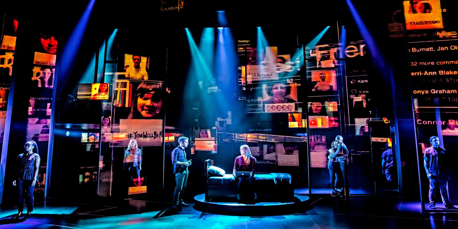
This lighting is from a production of the musical Dear Evan Hansen. The criss-crossed spotlights create confusion, which is aided by the combination of cool teal and blue/violet colors with the hot oranges, reds and yellows on the screens behind them. The way each spotlight is pointed at one or two individual actors creates the feeling of isolation. It's as if the characters are lost in a disorienting nightclub, or more likely (I have not seen this musical), judging by the bed center-stage as well as the laptop the girl on the bed has, in their rooms seeing alarming social media notifications (a conclusion drawn from the alarming red of the images/text, which also appear to be in motion, as if the characters are frantically scrolling through them). The spotlights also seem to be hitting thin vertical poles on the stage, which further delineates the characters and makes the scene as a whole look strangely virtual.
Interesting Lighting

I think the lighting in this scene is very interesting because rather than coming from a typical position of a high or front angle this light was placed directly behind the person in the prop. This makes the subject much more intense as it is silhouetted but has these strong streams of light accompanying them. The light does not have much color so it simply resembles sunlight, and I do not know what this scene depicts but it seems like the two people on the bottom are in a dungeon-like place and therefore far from the sun and freedom.
Interesting/Bad Color: Spiderman

Bad Color

Interesting/Bad Color
I will never forget the blue lighting that was used during the song "As Long As You're Mine" when I saw the show Wicked. I really think the lighting in this scene is very interesting because blue is not usually a color that is associated with love, romance, and passion, which are the essence of the scene and song. However, I think that with the fog and blue color, intimacy is developed and depicted. In addition, the lighting is also perfect for the scene because their romance is also unpredicted and surprising, just like the color. I also like how the fog acts as a filter to change the shape of the light making the atmosphere unclear and murky, just like the characters' futures.
 From: https://hollywoodlife.com/2015/04/06/wicked-tour-broadway-musical-ashley-parker-angel/

Interesting/Bad Color
Mary Poppins was one of the first shows I ever saw on Broadway, and I remember the scene from this photo distinctly because I thought the color of the lighting was very interesting. The lights that backlight the scenery have a red to a purple hue. I do not like the choice of color because I feel that this portrays something ominous, as red light is taking over the dark city represented by the silhouette. While I understand that the color could be a representation of the early morning, I did not think the deep red chosen was the best representation of the time of day. I also do not like the blue light that washes over the actors. While I understand this could be viewed as moonlight, as a viewer, I feel this makes an upbeat and stunning scene of elaborate dance numbers feel washed out and sullen.

Intresting lighting
 I really like this picture as the lighting is simple and beautiful. The people walking through fog lit only from the top of the stage sets a dramatic and to me a noble setting. The lack of details we can really get from this picture mean that our imaginations need to fill in the blanks for ourselves.
Bad lighting

I don't like the photo below, there is just to much going on for me. The lights have a cool effect with the smoke creating beams of visible light, but the amount of light and the background they are lighting up just hurts my eyes. This is one setting where less is more.
Monday, February 17, 2020
Interesting Light in Jersey Boys

Interesting Lighting

This is lighting from the Broadway show Dear Evan Hanson. What I find interesting about this lighting was the use of projecting media. It was able to produce both light and story telling to the production. Also by using cool toned lights for the actually stage against the firey orange tone of the media lights it creates a beautiful contrast as the more predominate colors, blue and orange, are complementary colors.
Interesting Lighting

This is Lighting from the Broadway show The Great Comet of 1812. I found this lighting extremely interesting as part of the set the large chandeliers are part of the lighting giving a warm hue to the actors, while and LED light was used in a cool hues when needing spotlights. I also liked how in the show, these chandeliers actually become the comet that was discussed throughout the show by having the intensity grow during the finale of the show. I believe that this was an interesting way to use light in a theater setting.
bad color: theatre

I chose this photo because it as an example of bad lighting on a larger scale and on a more professional scale. There is too much blue colored light in an inappropriate time in the show. We are unable to properly view the makeup, costumes, and props.
bad color: person

I chose this photo because I think it's a great example of how lighting and shadows make such a difference. Shadows can affect the shape, form, and size of facial features. Lighting can change skin tone and visibility. Only one of these faces is a good example of good lighting.
Saturday, February 15, 2020
personal photo: sunset

I took this photo driving on the highway at dusk. The sunset created such a warm glow on the horizon, I had to capture the moment. The colors make me feel soothed.
personal photo: spotlight

I appreciate how the natural sunlight shining through the tree limbs offers a spotlight effect. The background is in the shade so we are even more highlighted in comparison.
Thursday, February 13, 2020
Personal Photo: Cave

For my daylight picture, I included another picture of a cave (don't worry it's a different cave). I like that rather the cave being dark except for the light at the center, that there was some front lighting to light my subject. This way it felt less ominous and more hopeful. I also really like how the warm light at the center gives the rocks texture and how it just barely lights the tips of his hair.
Personal Photo: Red Light

For my night example, I've included a picture my friends and I took at an art festival. Because of the harsh, red LED lighting and the blurriness of the picture we nicknamed it the "hell picture." I love that it lights us from the bottom and how it completely floods the picture with red light. I typically associate red with anger, but because of our poses I don't think it reads that way.
Personal Photo: Garden

I took this photo at the Japanese Tea Garden. I really like how I was able to capture the shadows casted on the plants by the sun. I also like how the sun illuminates the water and makes it look like there are shades of blue and green within the water. Overall, the plants and the natural light invoke a sense of serenity.
Personal Photo: Concert

This is a photo that I took at a Lorde concert in 2018. The lighting of this show was phenomenal. In this photo, I like that I was able to capture the spotlights covering the singer. These lights made her dress look as if it were glowing. Additionally, I like the green light and blue fog that created an ethereal mood. The bright stage highly contrasted the darkness near the audience.
Vibrant Sky at Dusk

Moon Through a Tree

Wednesday, February 12, 2020
Personal Photo - Trinity Campus

I took this photo of a campus cat late last semester. I didn’t notice it at the time, but I think I captured some interesting lighting effects. It was a rainy afternoon, so the light filtered very subtly through the clouds. I am mostly struck by the reflections of light on the sidewalk, where you can tell where it had rained. You can see a shine in the puddles of water behind the cat, and a reflection of bright light in front of the cat, too. I think the reflections are very calming to look at.
Personal Photo - Mystic, CT

Personal Photo 2

Personal Photo 1

I took this picture of my roommate about two years ago in our old dorm room. The sun was setting, and she was wearing a very flower-child outfit, so we had a photoshoot. The low angle of the sunlight as well as its obstruction by the blinds made for warm and dramatic shots. The warm light compliments her sunglasses, dress, and makeup well. The concentration of the light on her face sets her apart from the shadowed background, and creates a moment of clarity in the otherwise dark room.
Fox
I like the lighting of this photo a lot it was taken up in the mountains in Arkansas and the background being pitch black coincides with the idea of foxes being a timid and skittish animal. The fox leaning away from the bright light shows how the oppressively bright light at night is so foreign to the fox.
Anole
This was an anole I saw that was just wondering about the campus. I like this photo as it was well light by the sun really showing off its scales. The light also shines through its dewlap making him have a splash of color.
Cast of a Tree's Shadow

I took this photo on campus as the sun was going down. I really like how the light is a warm, golden light that highlights what it falls on. The colors are brighter and more vivid in areas where the sun is shining, such as sections of the grass and bricks. The tree in the front is a great example of this as it demonstrates most clearly the contrast between the sunlight and shadows. The shadows created by the light cast on the trees creates lines and movement. The branches of the tree are dark and are dispersed among the bright blue sky. The shadows evoke a peaceful feeling as they hint at the sun setting, but also contrast the happier mood created by the sunlight and bright colors.
Sunset at National Harbor

I took this photo in National Harbor, just outside of D.C. at sunset. I really like how the light emphasizes the horizon as the warm light contrasts the blue of the sky and water. The water is clear and you can see the light reflected in the water. I like that the colors of the sky and water are more pale in direct contrast to the land, boats and trees that are dark as a result of the back lighting. The sunset gives the photo a somber and peaceful mood. The light allows you to see ripples in the water and the curved shape of the water, which creates movement and draws your eye throughout the photo.

This is a photo I took last spring break while in Iceland. I was in an ice cave where not much light reached. All of what is seen in this photo is ice. Most of it is dark because there isn't much natural light, but the blue light is coming from the sun piercing through the ice above and finding a hole in the snow. This light it quite beautiful to me. If anyone is a marvel fan, it reminds me of the Teseract.

This is a photo of me and my friends. We had stayed up all night finishing our essays for a class and decided to go watch the sunset. I love how the sun in emerging from a specific part in the sky where the clouds aren't very dense. Since there is such a bright light in the back, it makes it difficult to see us because there isn't much light on us in comparison.
Subscribe to:
Comments (Atom)