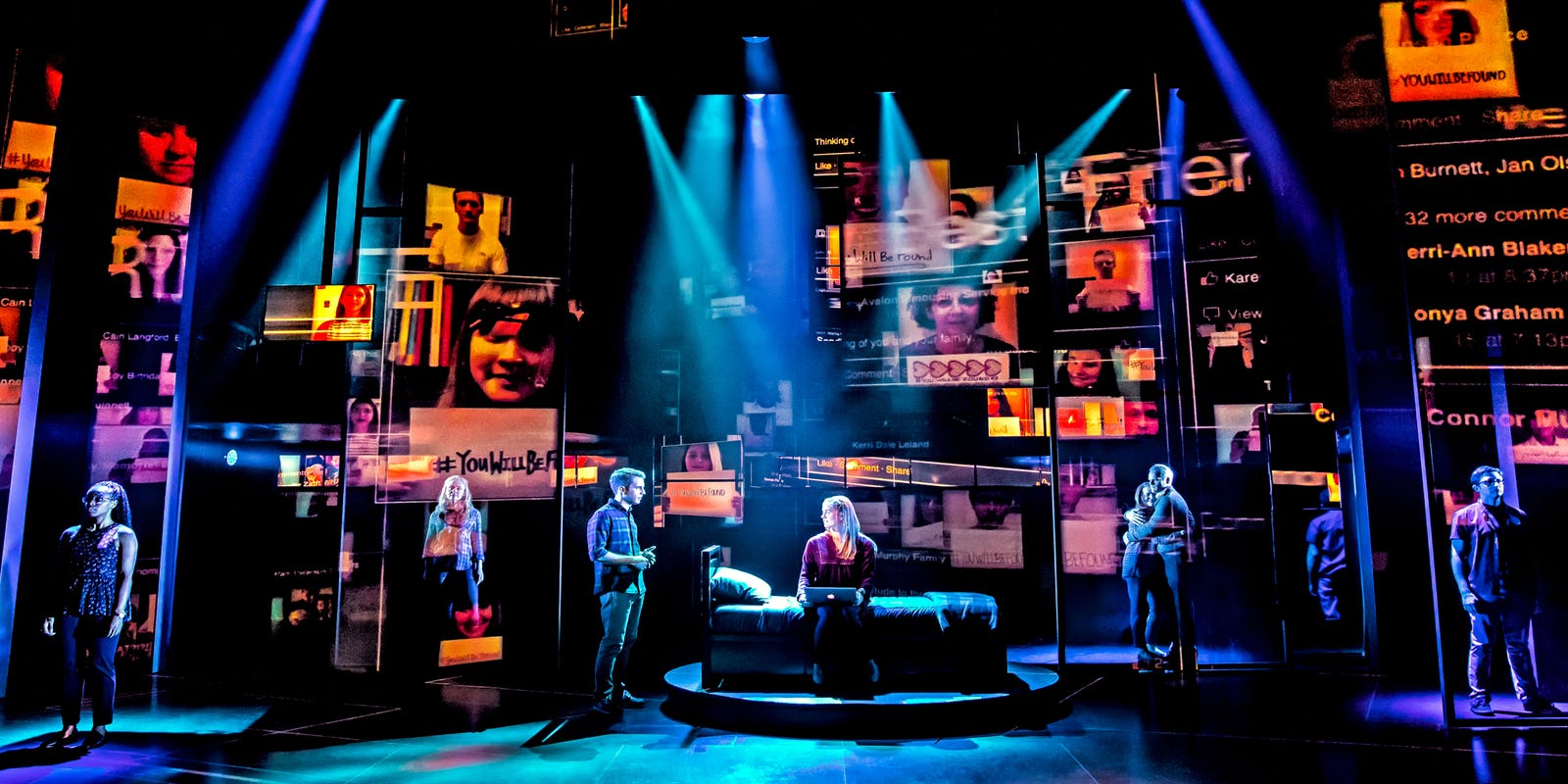
This lighting is from a production of the musical Dear Evan Hansen. The criss-crossed spotlights create confusion, which is aided by the combination of cool teal and blue/violet colors with the hot oranges, reds and yellows on the screens behind them. The way each spotlight is pointed at one or two individual actors creates the feeling of isolation. It's as if the characters are lost in a disorienting nightclub, or more likely (I have not seen this musical), judging by the bed center-stage as well as the laptop the girl on the bed has, in their rooms seeing alarming social media notifications (a conclusion drawn from the alarming red of the images/text, which also appear to be in motion, as if the characters are frantically scrolling through them). The spotlights also seem to be hitting thin vertical poles on the stage, which further delineates the characters and makes the scene as a whole look strangely virtual.
The lighting in this image is disorienting, but it seems very intentionally done—I especially love the use of two distinct color families, centered on blue and orange but spanning many distinct colors and shades around those. It does a nice job of allowing for a ton of different lights and visual elements without causing them to blend together.
ReplyDelete